Beskrivning
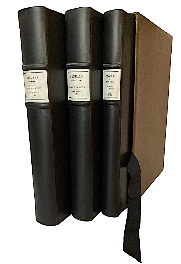
Franco Maria Ricci Editore, Parma. 1964-65. Volume Primo: (16), lxxii, 267 pages. Volume Secondo: (4) 279 pages including three folding plates of music types. Supplement: (8), 209, 74 plates, colophon. Loosely inserted a typespecimen, 8 pages, folio, folded once. Tall 4to (34 x 24,5 cm). Three volumes housed in a cloth slipcase. The edition is limited to 900 numbered copies, this no. 58. The three volumes are bound in full leather (each hide is used only for a single cover). Only top edges cut. The handmade paper was prepared at the old Pietro Miliani papermills in Fabriano, which once supplied paper to Bodoni. Thanks to the fortunate rediscovery of the original watermarking form, belonging to Marie Louise, duchess of Parma, it was possible to prepare paper for the flyleaves identical with that of the period, and with the watermarked image and coat of arms of the duchess.
Provenance Lars Hall (1938-2018) who was a prominent Swedish art director, graphic designer and a vivid book collector.
The Manuale Tipografico of 1818, posthumously printed by Bodoni’s widow, Margherita Dall’Aglio, together with Bodoni’s foreman Luigi Orsi, who continued to run her husband’s printing establishment, represents the synthesis of Giambattista Bodoni’s career, and contains, in more than six hundred plates, Latin and exotic letters and over one thousand ornaments and engraved borders by the great typographer. Ricci’s reprint, combining the original material and the results of research carried out in the Biblioteca Palatina in Parma, is in three volumes. To the two in facsimile, a study volume has been added, in four languages. It was written by Angelo Ciavarella, director of the Bodoni Museum at the time. Besides containing a historical and bibliographical essay on Bodoni’s methods of creating and casting type, it is supplemented by highly unusual documents of extreme importance, such as page proof s, drafts, discarded sheets, letters, inventories of matrices, etc., all in exact facsimile of the originals.
Franco Maria Ricci had long insisted that Bodoni was not only a typographer. He achieved modernity and elegance through graphic art. He was, like Canova, a champion of neoclassicism but in two dimensions. I immediately fell in love with the proportions, the concept of beauty. Bodoni’s genius was not simply the freshness, rigour and precision of the typefaces, with their dramatic contrasts between thick and thin line, but also his sense of how to lay out a page. Texts are set with extravagantly wide margins and with little or no decoration.
Ricci decided to reproduce the master’s Manuale Tipografico, although everyone told him he was mad to do it. He bought two early offset typography machines which, he noted, were ‘as expensive as a Ferrari, which I wanted to buy but never did’, and had the highest-quality paper made exclusively for the project by Fabriano. It took a year to publish the three volumes in 900 numbered copies (1964–65). ”So I became a publisher. It became a bestseller.”


Recensioner
Det finns inga produktrecensioner än.