Beskrivning
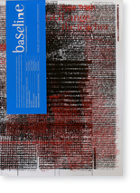
Bradbourne Publishing Ltd., East Malling. 2001. 52 pages. Tall 4to (34,5 x 24,5 cm) Stiff paper wrappers with jacket. Contents; Editorial team & Ken Garland: Reviews. Steven Heller: Do It Yourself: the graphic design of punkzines. Prof. Frank Philippin: Can packaging be honest? Quentin Newark: Type Trash. Wolfgang Baum: GG Lange the teacher. Nicola Bailey: Distressed letters. Tony Richards: Designed to perfection – the work of Frank Overton. Editorial team: Lexicon – An A–Z of typographers (C–G).
If typographic discipline is the (loose) thread, which we can trace through this issue, then contrast is the sub-plot. The anarchic punk zines receive a lively analysis (from the American side) by Steven Heller, a subject where establishing typo-rules would defeat the object.
From anarchy to social responsibility, as Frank Philippin strives to achieve a design structure, for consumer packaging, where setting the correct rules should eliminate visual ambiguities Meanwhile, can a random selection of printed ephemera reflect the image of a city? Quentin Newark argues the case.
Back to discipline, as the students of the daunting GG Lange reflect on the impact of his teaching methods. Breathing space, with Nicola Bailey’s photographic essay on another of our favourite themes – typographic distress. And, sticking to the rules has played its part in the typographic œuvre of Frank Overton, journeyman designer, enthusiastically endorsed by Tony Richards.


Recensioner
Det finns inga produktrecensioner än.